Snip
|
Are most online data visualisations, well, just not very...
|
|---|
Categories |
|
|---|
For Snip |
loading snip actions ... |
|---|---|
For Page |
loading url actions ... |
Are most online data visualisations, well, just not very good?
It's an issue we grapple with a lot - and some of you may have noticed a recent backlash against many of the most common data visualisations online.
Poor Wordle - it gets the brunt of it. It was designed as an academic exercise that has turned into a common way of showing word frequencies (and yes, we are guilty of using it) - an online sensation. There's nothing like ubiquitousness to turn people against you.
In the last week alone, New York Times senior software architect Jacob Harris has called for an end to word clouds, describing them as the "mullets of the Internet". Although it has used them to great effect here.
While on Poynter, the line is that "People are tired of bad infographics, so make good ones"
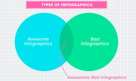 Awesomely bad infographics from How to Interactive Design Photograph: How To Interactive Design
Grace Dobush has written a great post explaining how to produce clear graphics, but can't resist a cry for reason.
What's the big deal? Everybody's doing it, right? If you put [Infographic] in a blog post title, people are going to click on it, because they straight up can't get enough of that crap. Flowcharts for determining what recipe you should make for dinner tonight! Venn diagrams for nerdy jokes! Pie charts for statistics that don't actually make any sense! I have just one question—are you trying to make Edward Tufte cry?
HTML |
<p>Are most online data visualisations, well, just not very good?</p><p>It's an issue we grapple with a lot - and some of you may have noticed a recent backlash against many of the most common data visualisations online. </p><p>Poor <a href="http://www.wordle.net/">Wordle</a> - it gets the brunt of it. It was designed as an academic exercise that has turned into a common way of showing word frequencies (and yes, we are guilty of using it) - an online sensation. There's nothing like ubiquitousness to turn people against you.</p><p>In the last week alone, New York Times senior software architect Jacob Harris has called for an end to word clouds, describing them as the "<a href="http://www.niemanlab.org/2011/10/word-clouds-considered-harmful/">mullets of the Internet</a>". Although it has used them to great effect <a href="http://www.nytimes.com/interactive/2009/01/17/washington/20090117_ADDRESSES.html">here</a>. </p><p>While on Poynter, the line is that "<a href="http://www.poynter.org/how-tos/newsgathering-storytelling/visual-voice/149636/people-are-tired-of-bad-infographics-so-make-good-ones/">People are tired of bad infographics, so make good ones</a>"</p> <span class="inline wide"> <img src="http://static.guim.co.uk/sys-images/Guardian/Pix/maps_and_graphs/2011/10/17/1318848722779/Awesomely-bad-infographic-007.jpg" alt="Awesomely bad infographics" height="276" width="460"> <span class="caption" style="width: 460px;"> Awesomely bad infographics from <a rhef="http://www.howinteractivedesign.com/designing/quit-it-with-all-the-infographics-already-infographic">How to Interactive Design</a> Photograph: How To Interactive Design </span> </span> <p><strong></strong></p><p>Grace Dobush has <a href="http://www.howinteractivedesign.com/designing/quit-it-with-all-the-infographics-already-infographic">written a great post</a> explaining how to produce clear graphics, but can't resist a cry for reason.</p><blockquote class="quoted"><p>What's the big deal? Everybody's doing it, right? If you put [Infographic] in a blog post title, people are going to click on it, because they straight up can't get enough of that crap. Flowcharts for determining what recipe you should make for dinner tonight! Venn diagrams for nerdy jokes! Pie charts for statistics that don't actually make any sense! I have just one question—are you trying to make <a href="http://www.edwardtufte.com/tufte/books_vdqi">Edward Tufte</a> cry?</p></blockquote> |
|---|